
Introduction
This article, I shared basic R programming skill with Five Questions by Datasets for R Practice. ( diamonds, mtcars and chickwts)
About Dataset
diamonds
A dataset containing the prices and other attributes of almost 54,000 diamonds.
- price : price in US dollars ($326–$18,823)
- carat : weight of the diamond (0.2–5.01)
- cut : quality of the cut (Fair, Good, Very Good, Premium, Ideal)
- color : diamond colour, from D (best) to J (worst)
mtcars
The data was extracted from the 1974 Motor Trend US magazine, and comprises fuel consumption and 10 aspects of automobile design and performance for 32 automobiles (1973–74 models).
- mpg : miles/(US) gallon
- hp : gross horsepower
- wt : weight (1000 lbs)
- am : transmission (0 = automatic, 1 = manual)
chickwts
An experiment was conducted to measure and compare the effectiveness of various feed supplements on the growth rate of chickens.
- weight : the chick weight.
- feed : the feed type
Analyst
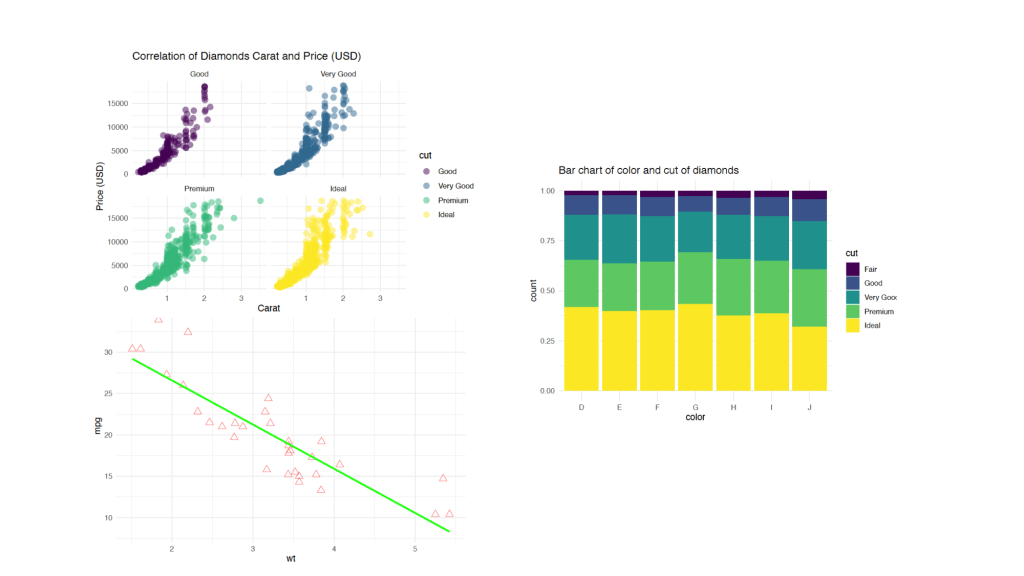
What is the correlation between the carat of the diamonds and the price ?
This question, I used random sampling by 5 percent of dataset ( diamonds ). I’m a filter quality of the cut such as ideal, premium, very good, and good. and I’m provided this data in new object ( small_df )
I used library ggplot in part of tidyverse. In aesthetic mappings in define x axis = carat, y axis = price and colour divided by quality of the cut. I used facet_wrap for subplot by quality of the cut.
set.seed(18)
small_df <- diamonds %>%
  sample_frac(0.05) %>%
  filter(cut %in% c("Ideal","Premium","Very Good", "Good"))

ggplot(small_df,aes(carat, price, col = cut)) +
  geom_point(alpha = 0.5, size = 3) +
  theme_minimal()+
  facet_wrap(~cut) +
  labs(title = "Correlation of Diamonds Carat and Price (USD)",
    x = "Carat",
    y = "Price (USD)")
Conclusion : When the carat weight increases then the price of diamonds increases. All quality of the cut have the same pattern
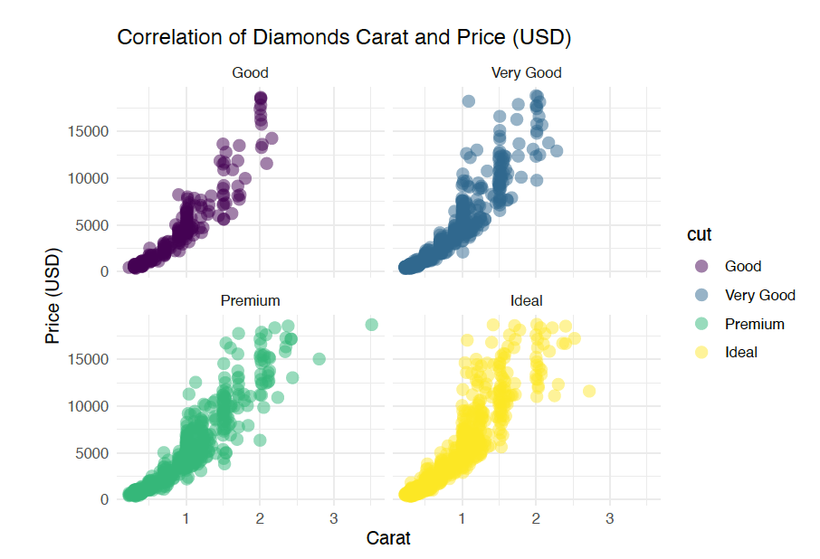
How many car used transmissions between automatic and manual ?
This question, I used all data of dataset ( mtcars). I’m a filter some columns in dataset ( hp, wt, and am ).
In aesthetic mappings in define x axis = am and color divided by am.
mtcars %>%
  select(hp, wt, am) %>%
  mutate(am = ifelse(am == 0, "Auto", "Manual")) %>%
  ggplot(aes(am, fill = am)) +
  geom_bar() +
  theme_minimal() +
  labs(title = "Auto cars vs. Manual cars")
Conclusion : An automatic transmissions cars approximately nearly 19 and Manual cars nearly 13.
What is the correlation between weight and mpg of cars ?
This question, I used all data of dataset ( mtcars). I’m a filter some columns in dataset ( hp, wt, and mpg) and provided in mtcars_df. In aesthetic mappings in define x axis = wt, y axis = mpg. I applied linear regression in for find correlation between weight and mpg of cars.
mtcars_df <- mtcars %>%
  select(hp,wt,mpg)

ggplot(mtcars_df, aes(wt,mpg)) +
  geom_point(size = 3, alpha = 0.5, col = "red", shape = 2)+
  geom_smooth(method = "lm", se = F, col = "green") +
  theme_minimal()
#Use cor( ) For Find correlation.
cor(mtcars$wt, mtcars$mpg)
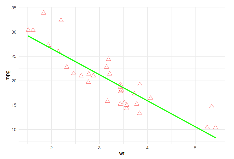
Conclusion : Correlation between weight and mpg of cars is -0.868. A fairly strong negative correlation. It affected to the slope of a line that is trending downwards. It means that as the weight of cars increases then the mpg of cars decreases.
Find the type of diamond cuts by the color ?
This question, I want to know about proportion in diamonds. In aesthetic mappings in define x axis = diamond color and color divided by quality of the cut.
ggplot(diamonds,aes(color,fill = cut)) +
geom_bar(position = "fill" ) +
theme_minimal() +
labs(title = 'Bar chart of color and cut of diamonds')
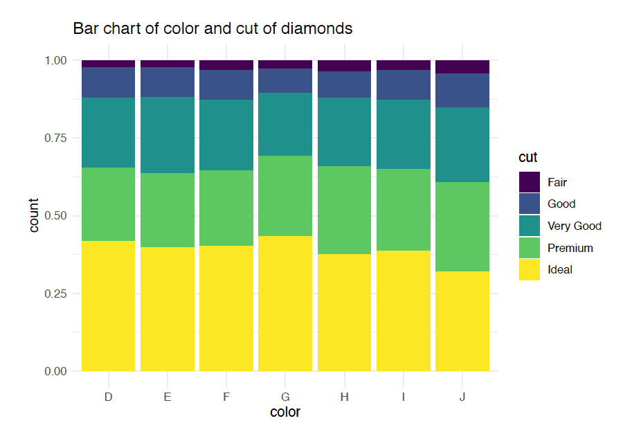
Conclusion : The ideal diamonds have the greatest proportion than others.
Find the box plot of chicken weights by feed types ?
df34 <- chickwts %>%
  select(weight,feed)

ggplot(df34 , aes(feed,weight, col = feed)) +
  geom_boxplot() +
  theme_minimal()
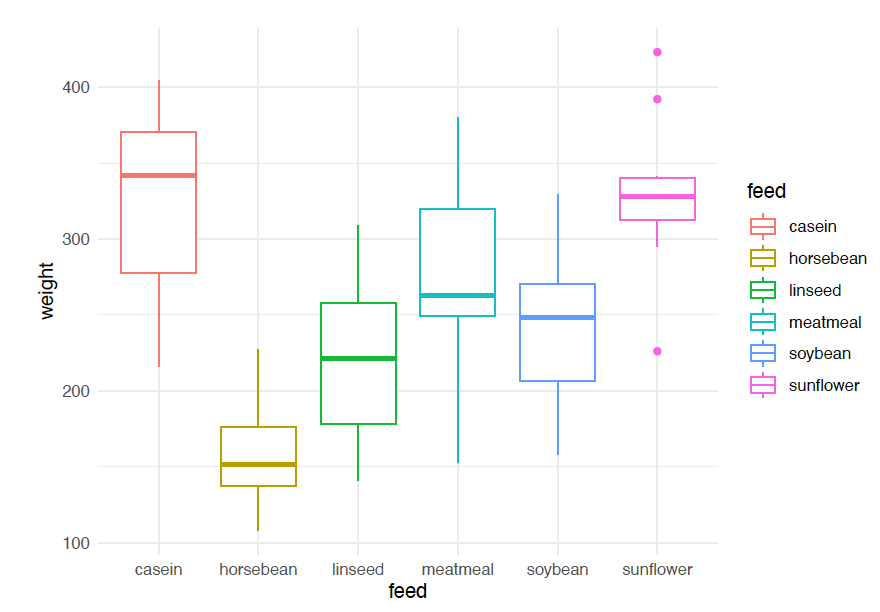
Conclusion : The median value of chicken weighs feed by casein is the most than other.

Leave a comment